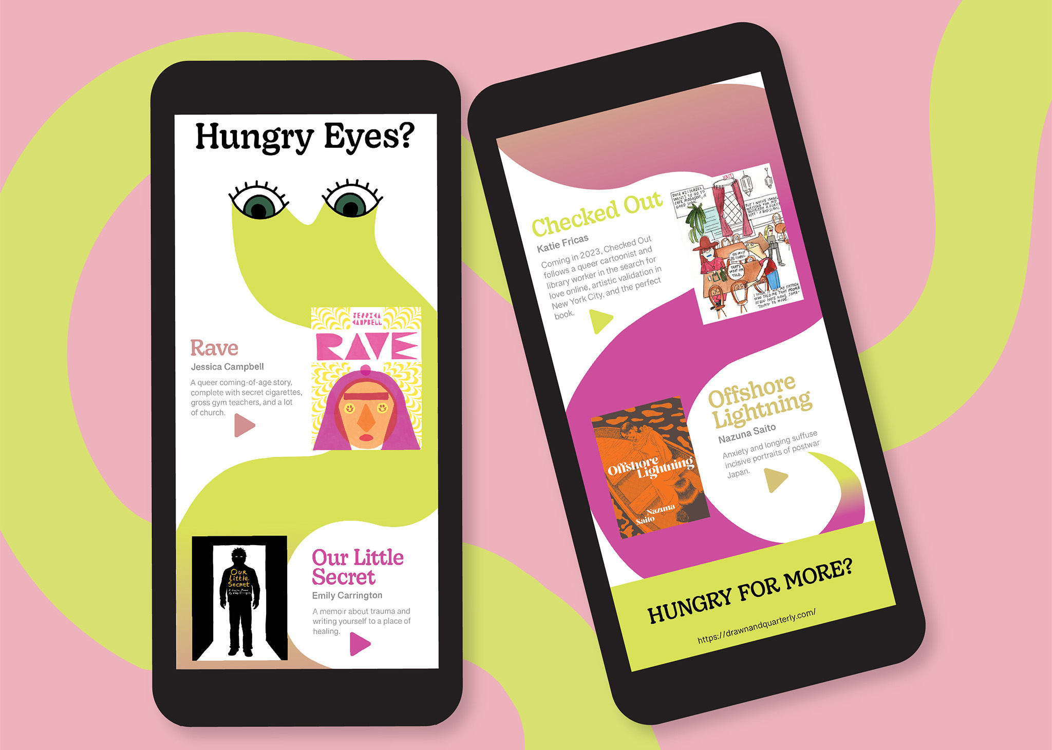
Drawn & Quarterly Email Newsletter

Project Outline:
I completed this project in my first year graphic design class. I was tasked with designing an interesting email newsletter for an existing publication, among a few options. I chose Drawn & Quarterly because of my love for illustration.
My Concept:
I wanted to play to my audience with this project, so I decided from the get-go I was going to have an illustration as my background. However, I didn’t want to take away too much interest from the publications I was presenting, so I decided I would use it to guide the viewer through them instead. This is where I got the idea for a very abstract, simple sort of snake-snail creature. I gave it big eyes and the tagline “Hungry Eyes?” to playfully grab the interest of the reader and then guide them down through the information, leaving them with a “Hungry for More?” call to action tagline at the bottom. The soft shape and colours provide a pleasant backdrop for the viewer to scroll through.
My Process:
I started by exploring the Drawn & Quarterly website to get to know the humour and tone of the brand and to select which content would be most appropriate to highlight in my newsletter. I then started sketching my layout and concept, and when I was satisfied, I brought it into Adobe Illustrator and began illustrating. Next, I brought my illustration into InDesign to add in and organize the content. After a first round of feedback and polishing, I was left with this.
What I learned:
This was a very interesting project for me; it was the first real project of my second semester and it allowed me to really explore using design concepts like visual hierarchy, negative space, and flow to elevate my work. I think I really captured the spirit of Drawn & Quarterly in this newsletter, and that is what I am most proud of in this project.

