Myel Brochure

Project Outline
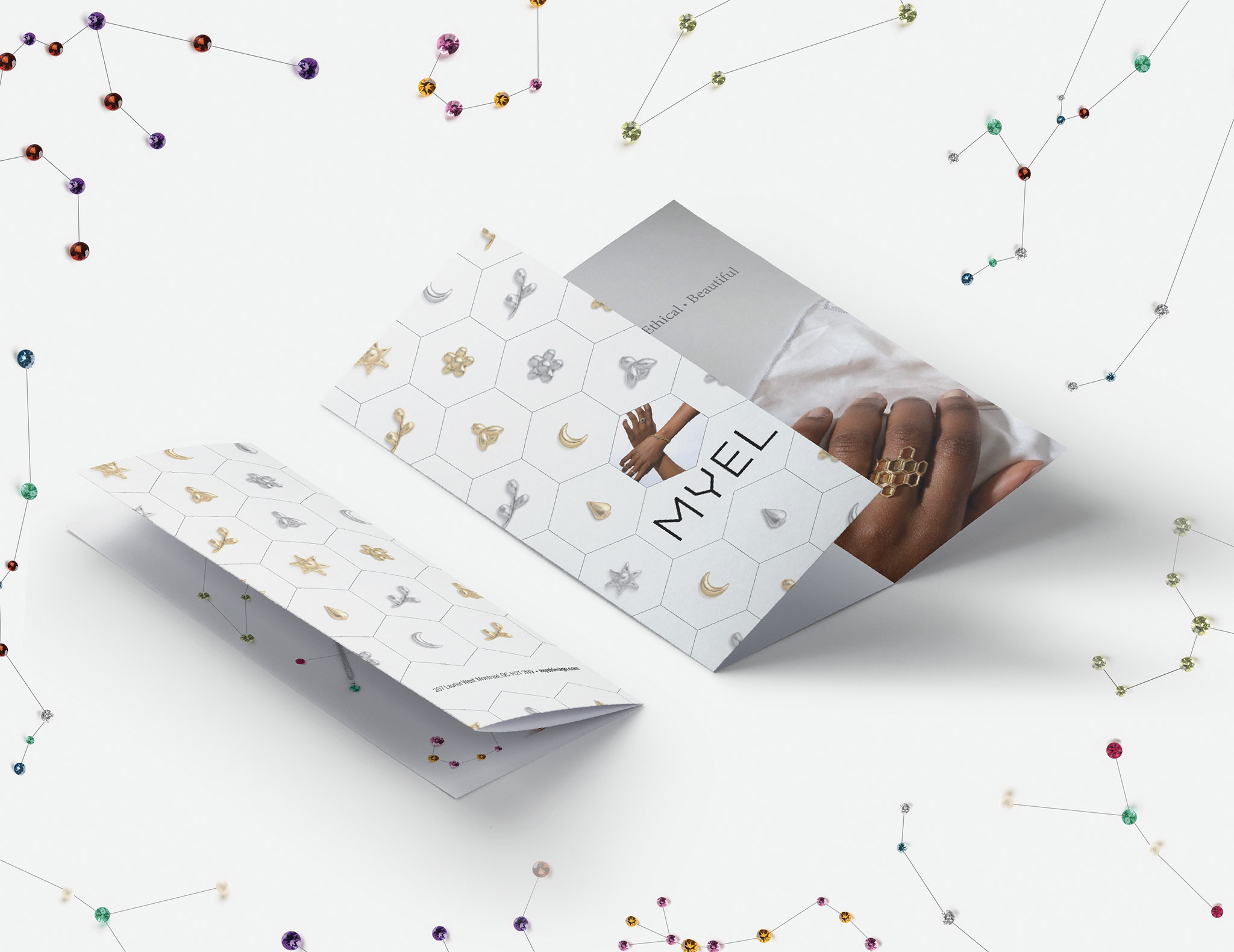
This project was completed in my second year of the program. I was tasked with creating a promotional tri-fold brochure for one of the three pre-existing local companies suggested by the teacher. I chose the fine jewellery company, Myel. I was permitted to use any content I wanted from their website with the goal of making the brochure stand out while still fitting into the pre-established brand identity and aesthetics of the company.
The Concept
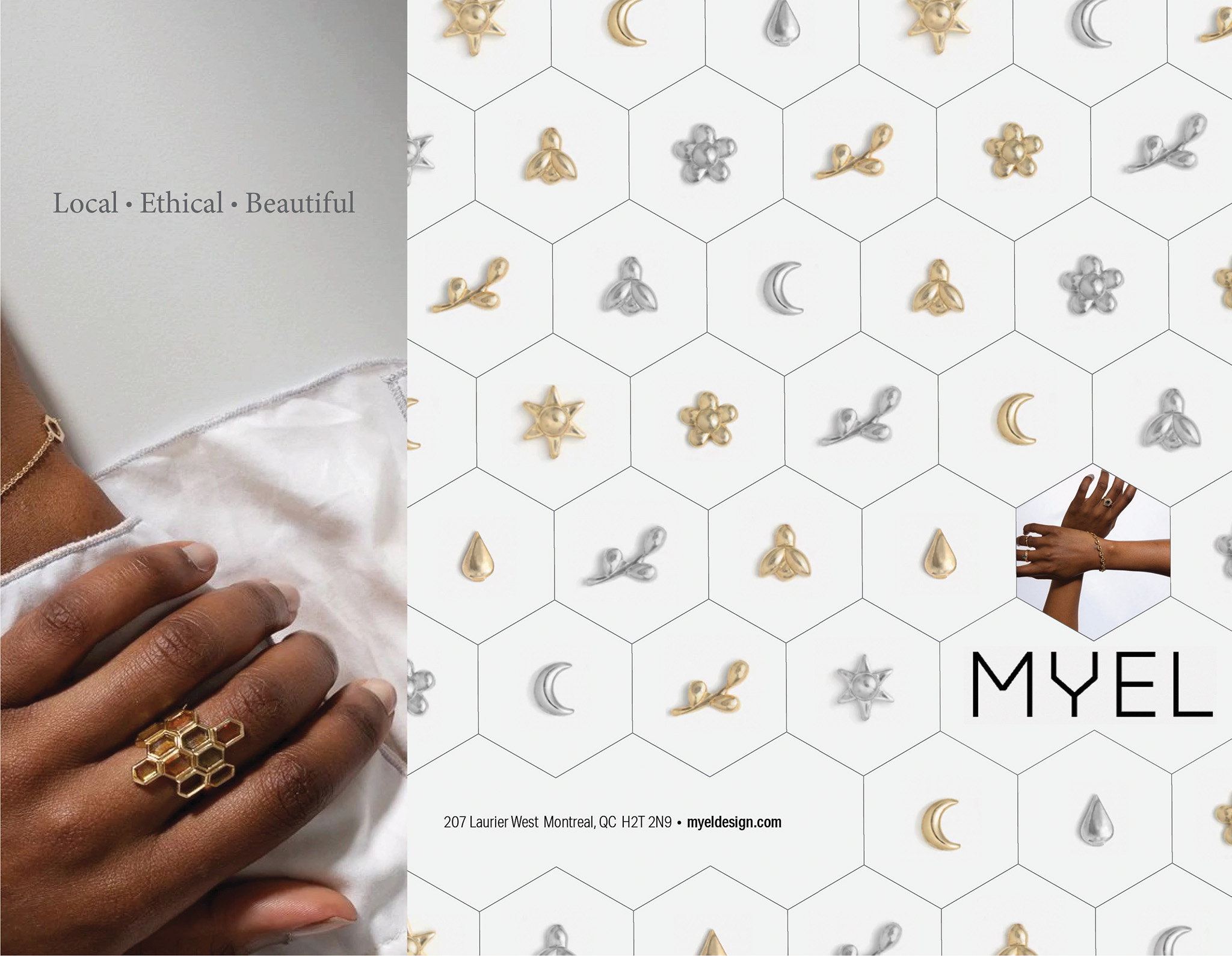
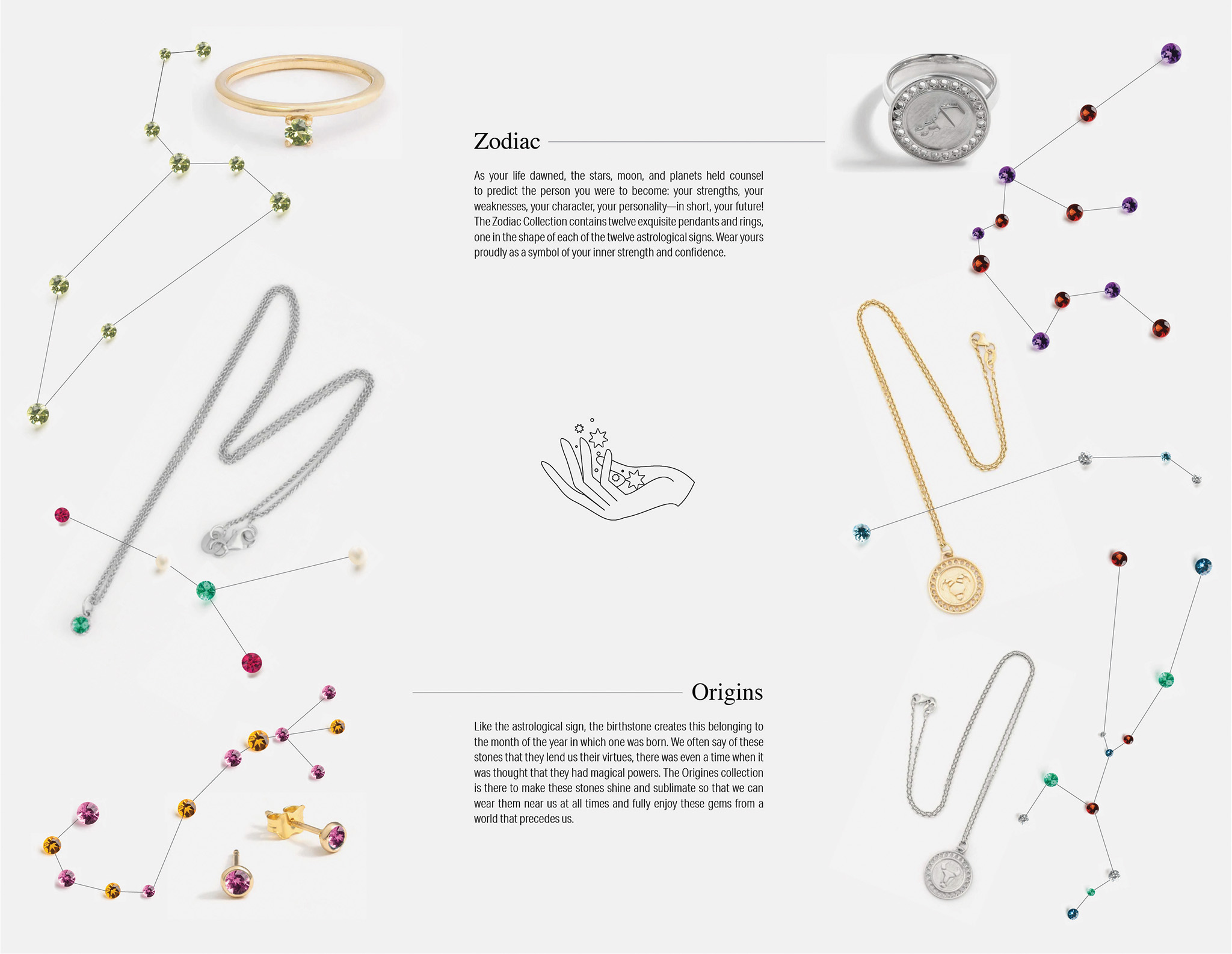
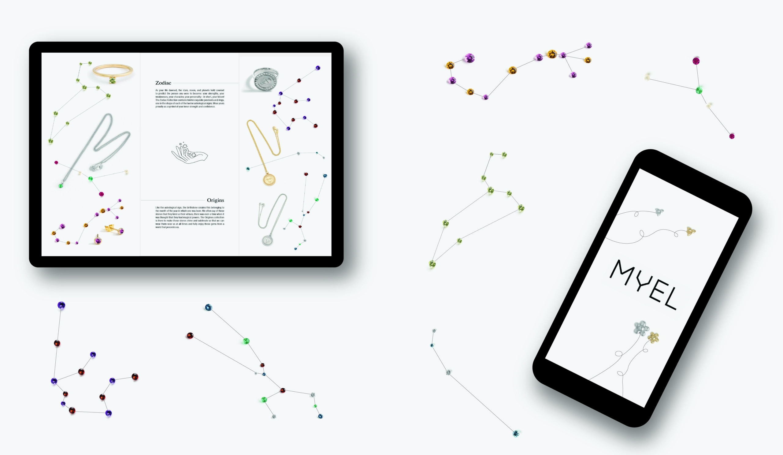
I started by selecting two jewellery collections from the Myel website that I thought would complement each other: Zodiac, which was a zodiac sign-themed collection of jewellery, and Origins, which was a birth stone-based collection. I thought both of these collections implied a belief in astrology and a desire for a more customizable, personalized approach to jewellery; hence, they would appeal to the same demographic. I created the different zodiac constellations using the associated birth stones as the stars. For the front, I wanted to evoke the wider themes of MYEL as a company by including the honeycomb pattern and adding the charms from their original customizable collection into the pattern. I used some photography but kept it very restrained, with a little bit on the front incorporated into the pattern to draw in the viewer and a larger image on the opening flap to show off their biggest and most intricate ring alongside their main values. I also made use of the very thin illustrations present on the website by incorporating a hand and adding some stars to imply the celestial mood of the zodiac jewellery.


The Process
I sketched it out and then created my initial design in Adobe InDesign. I presented my initial version in class, and after some feedback, I made the lights thinner to reduce their visual weight and reflect the delicate nature of the jewellery. I also added more negative space by reducing my type size. After a few test prints, I was left with the much more polished version here.
What I learned
I have a very colourful and organic personal style, so it was a creative challenge for me to come up with an interesting concept that held true to the more restrained, less colourful, and more minimal look of the brand. I learned that sometimes working within a more restrictive palette and style can push me to come up with even more compelling designs, and that I am capable of making a very refined and delicate design.

