Chez Mamie Brand Identity
Project Outline:
In my second year I was asked to create a fictional company and develop it’s brand identity. I chose to create a grandma’s house themed brunch restaurant and cafe called Chez Mamie.
My Process and Concept:
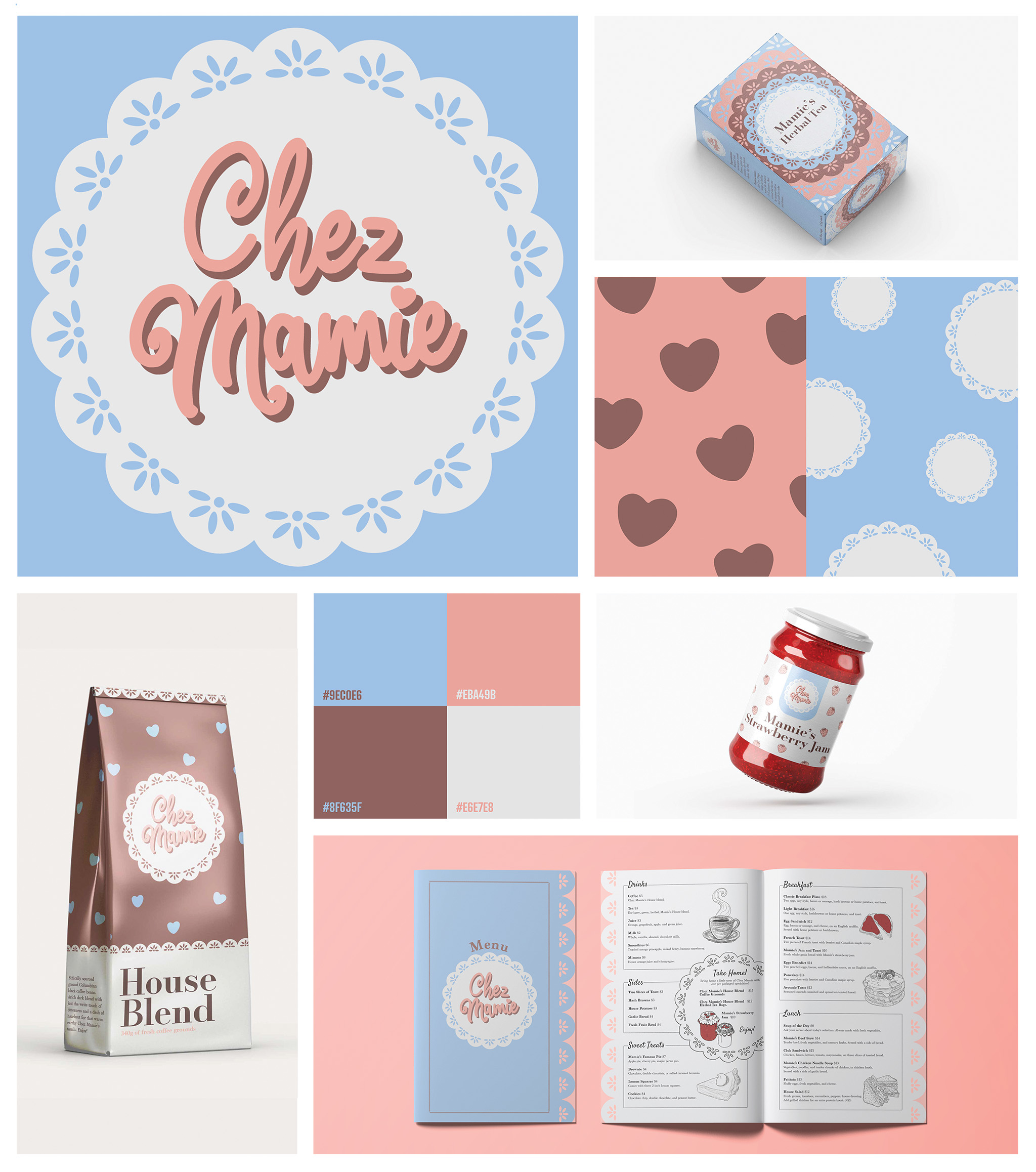
I started by narrowing down the values and goals of my company and by creating a few detailed customer analysis profiles so that I could tailor my branding to best appeal to my intended clients. I first chose my color palette using 1950’s American diner decor as my inspiration. Next I chose my main visual elements using a mix of grandmother-reminiscent visuals like hearts and doilies. The name Chez Mamie was selected because I wanted to evoke sense of belonging and comfort as well as appeal to the Quebec audience through humour and self-reference. With this base identity established, I was ready to start designing my various assets.
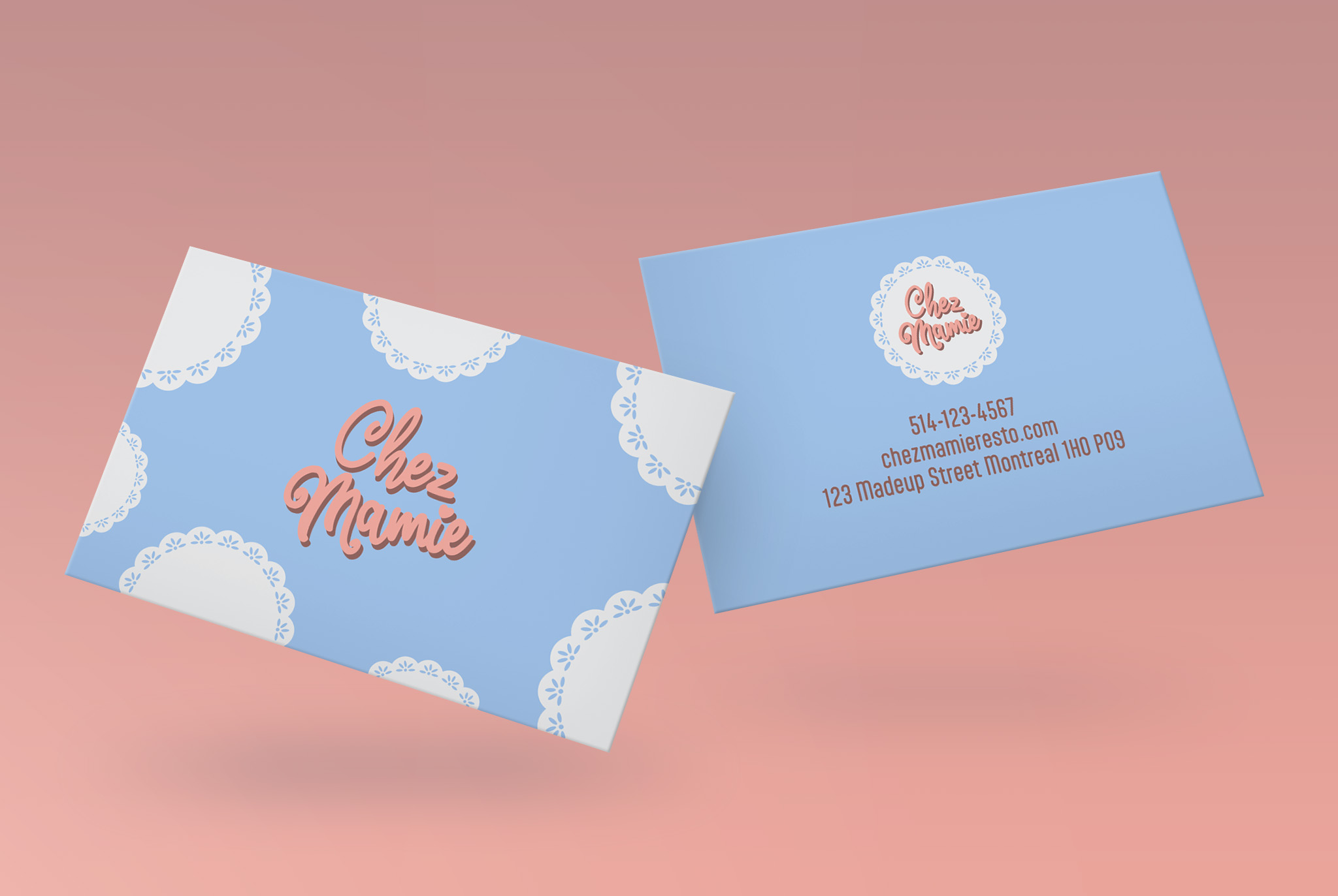
Business Cards:
The first thing I was asked to design was the logo and business card. I kept the design simple and clean. in the final design I would opt for a spot varnish on the doilies and logos for a bit more dimension and interest.
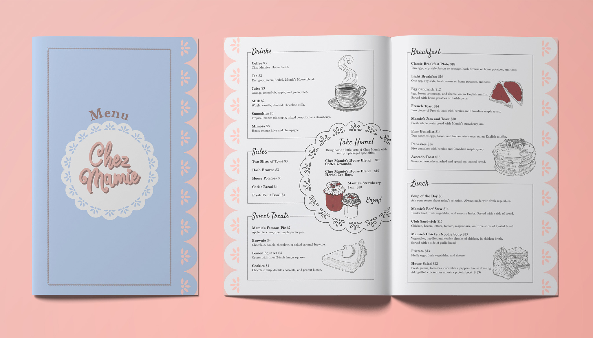
The Menu:
I had a really good time creating the menu. I was inspired by old cookbook illustrations and recipe cards. This motivated my choice to use a hand drawn illustrative style to present the food. I also chose to make the edges cut out like doilies as a fun detail.
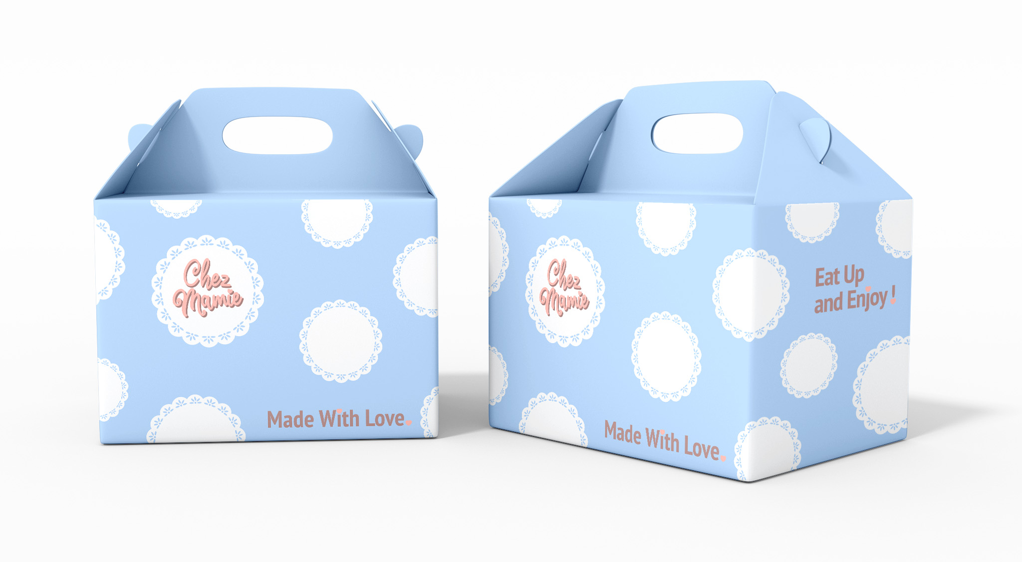
To Go Boxes:
I kept the to go boxes very simple and modern. They, like the business cards are meant to peak customer interest as well as convey a friendly atmosphere thus, encouraging the consumer to covet the sit-down restaurant experience and pursue it.
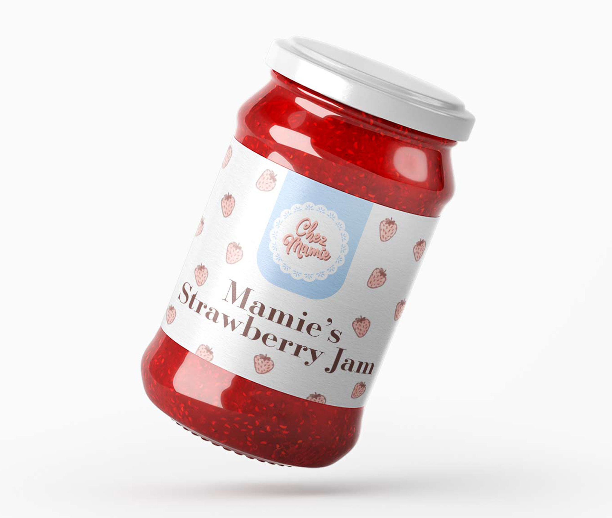
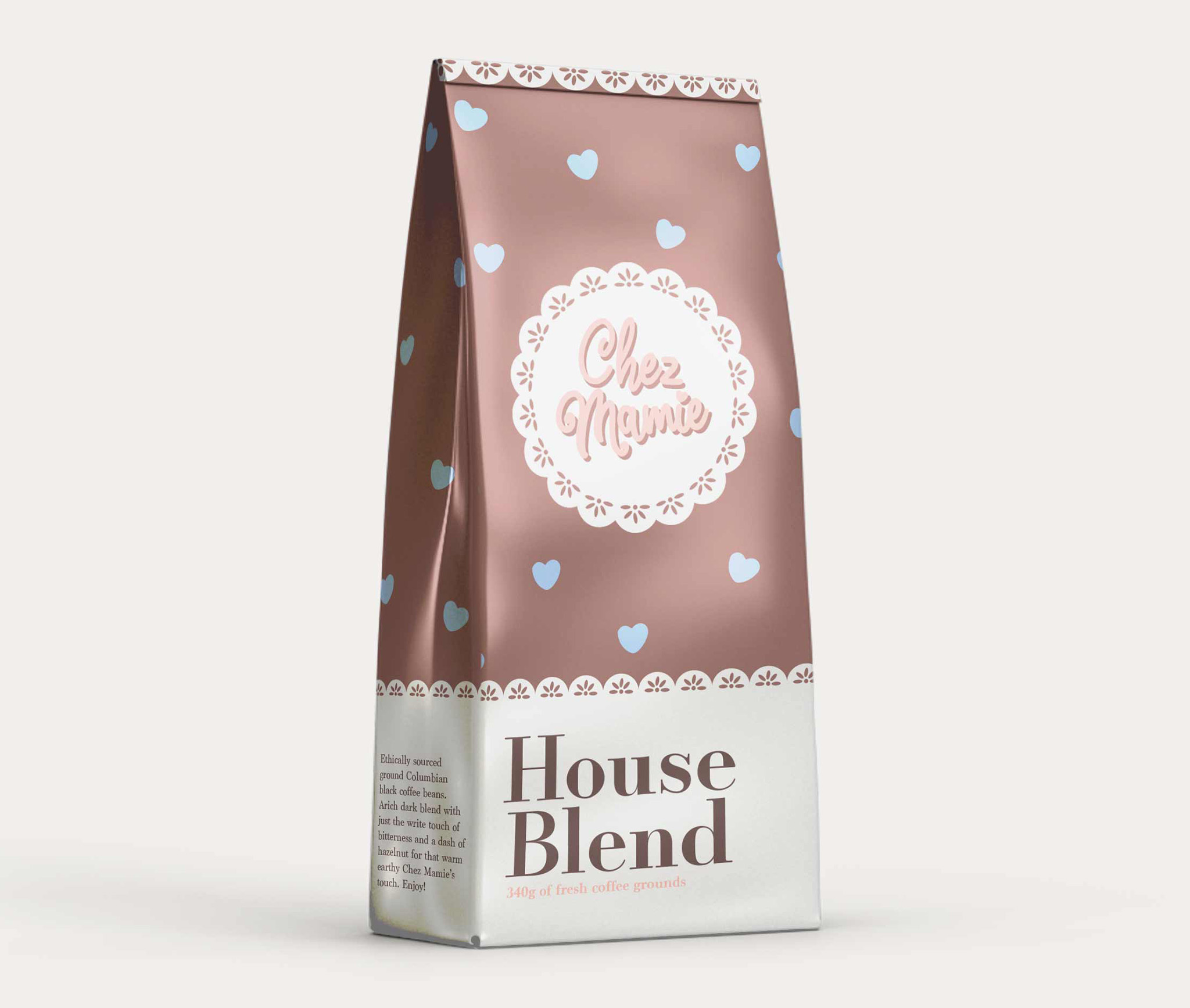
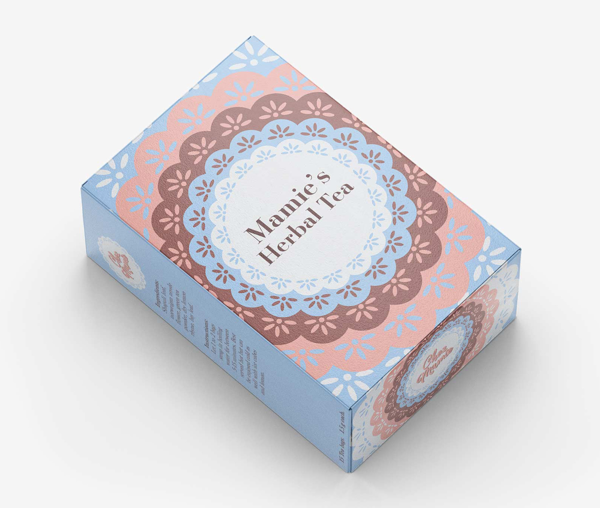
Packaging Design:
I really stuck to the established colors and patterns for my packaging design. I wanted them all to evoke the brand while also being very different and tailored to the specific product being packaged. These designs were made not for school but as a part of a personal challenge. I gave myself only and hour to make each mockup and I am pretty proud of how they came out despite this.
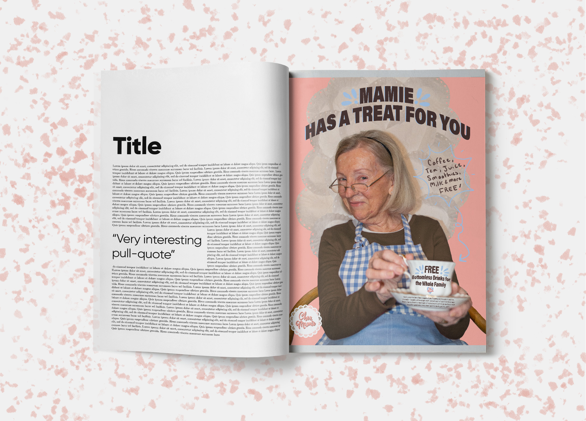
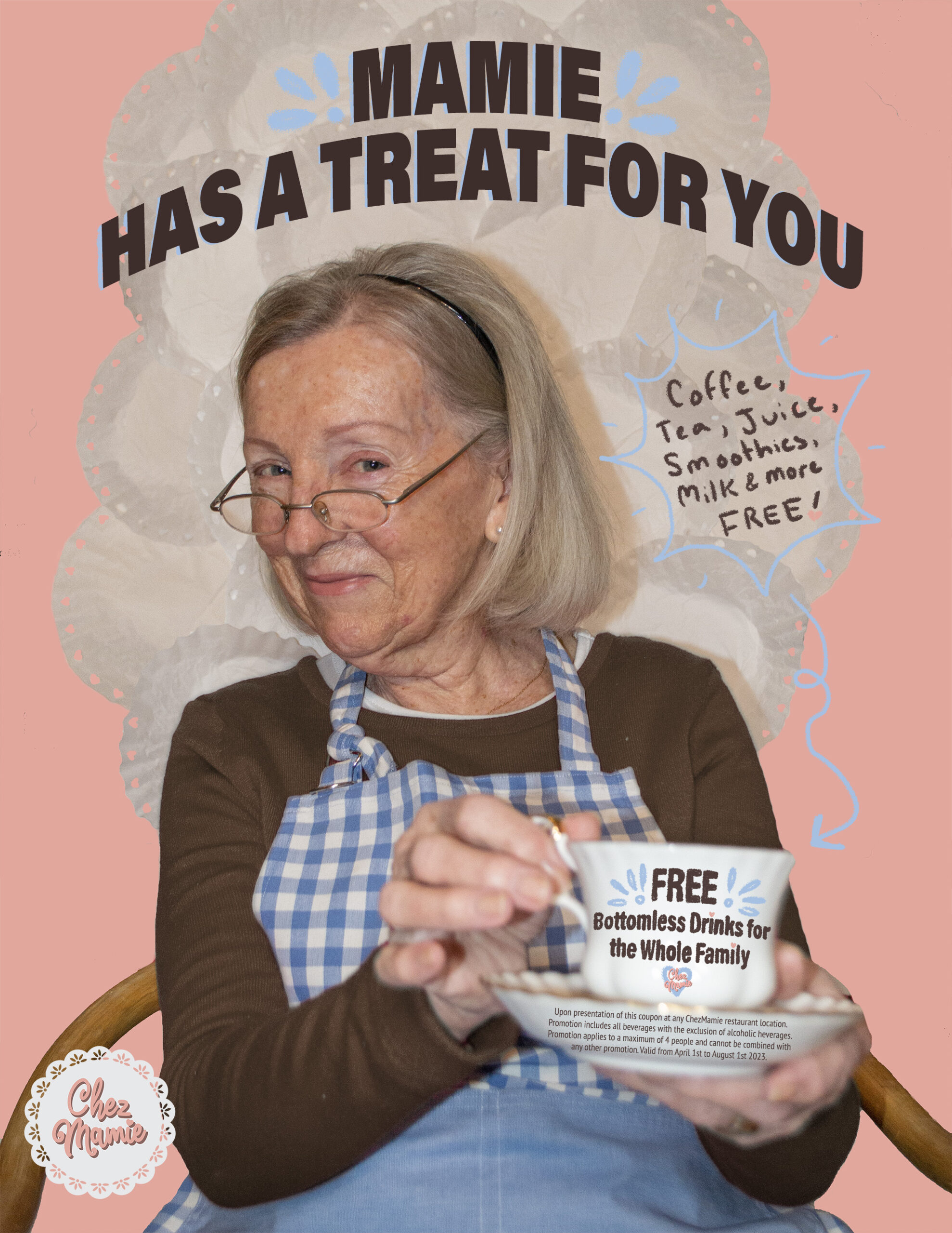
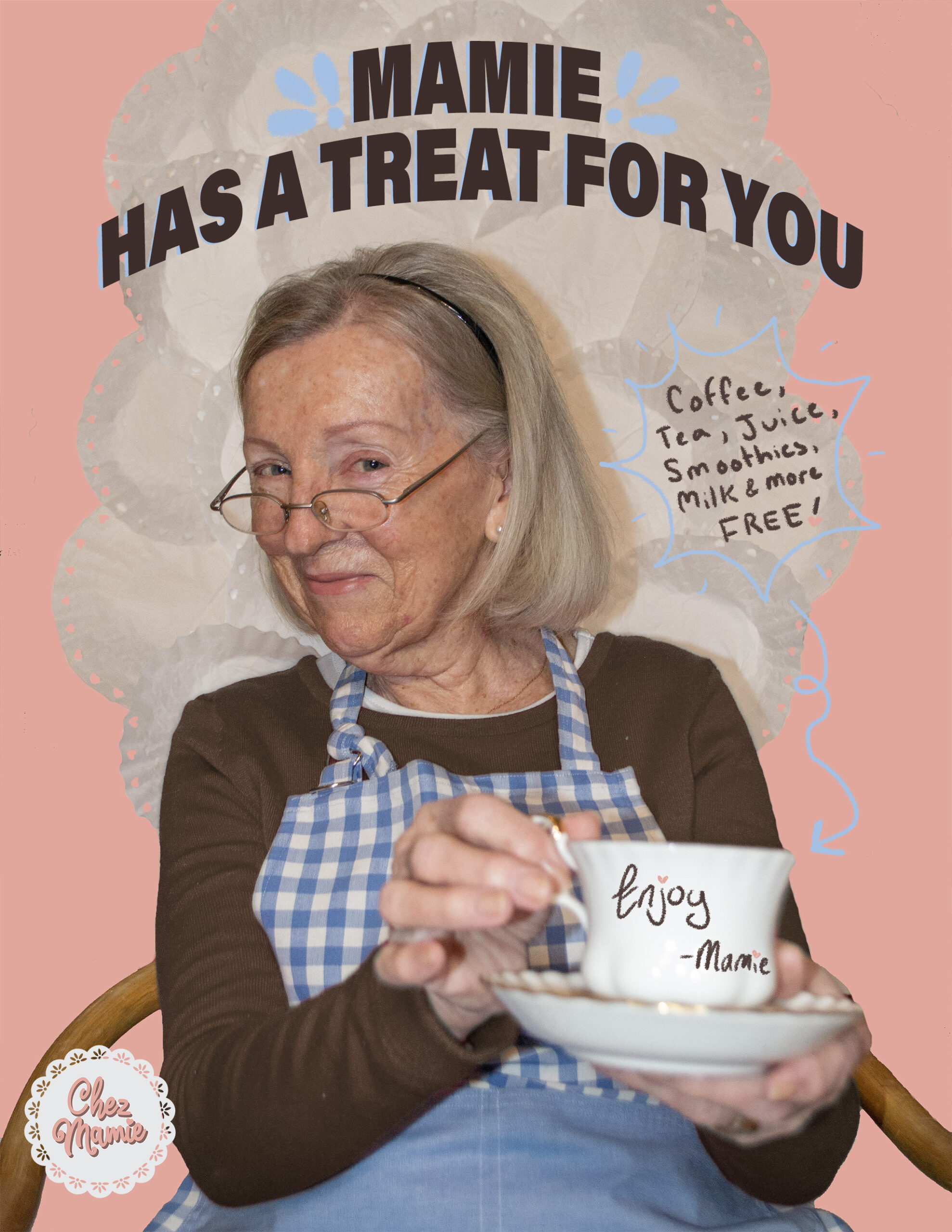
Magazine Ad:
I wanted to have some fun with the ad project by employing some humour and introducing a mascot to the brand. So, I employed the help of my very own Mamie. I built a doily throne for her, took some photos and after lots of editing and adding some fun, informational elements I had a really playful and compelling result. I chose to include a coupon in my ad as well as a call to action for the consumer. The two final images illustrate the before and after of removing the tea cup shaped coupon.